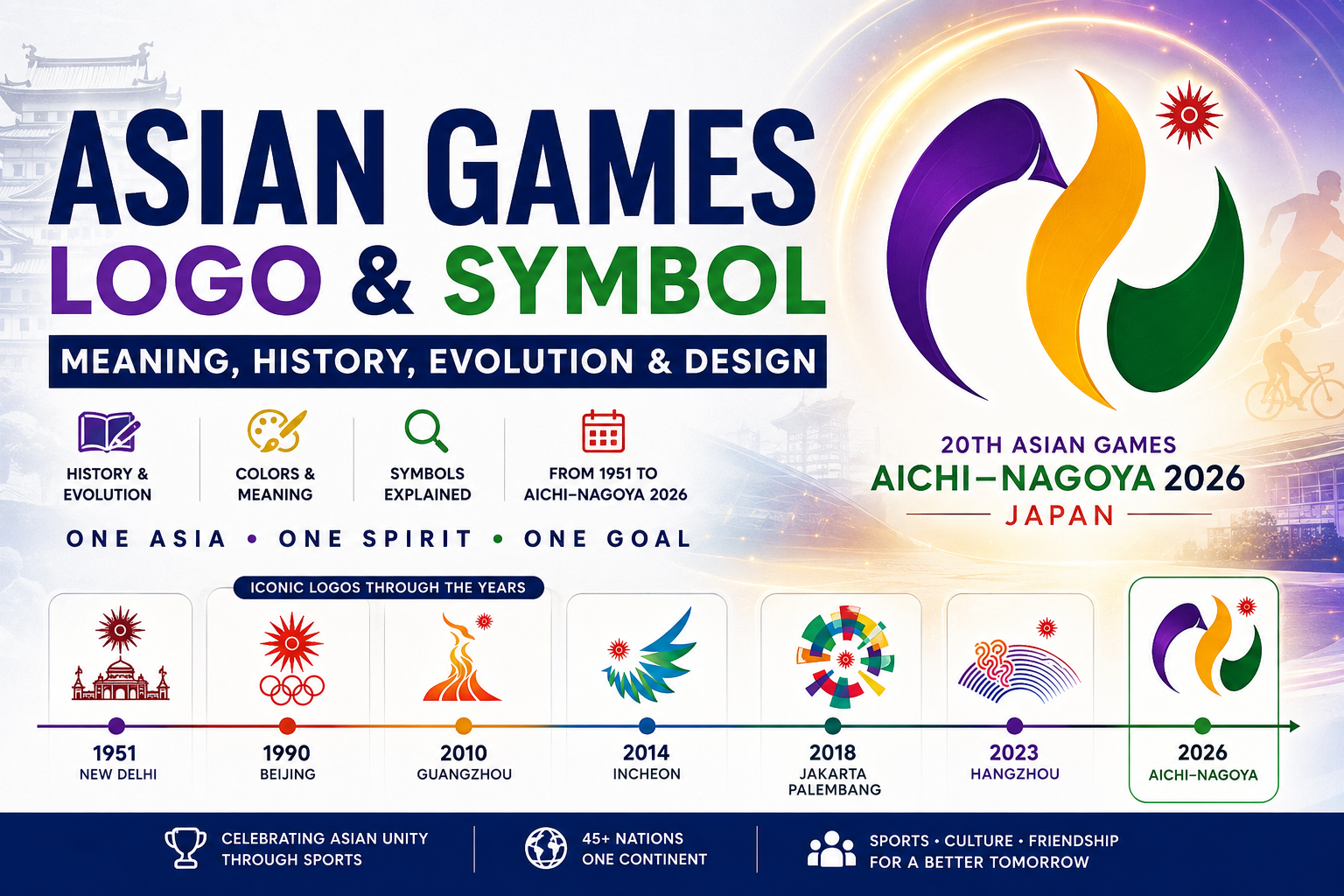
Asian Games Logo & Symbol: Meaning, History, Evolution & Design
Why is there an Asian Games Logo & symbol, and what’s all these cities have different logos and symbols for each city? The Asian Games logo is more than a symbol; it signifies sport, unity among people of Asia, and the culture and identity of the host city. These designs have evolved since then, leading to new concepts, colours, symbols and stories for each of the Games from 1951 in Delhi to Aichi–Nagoya 2026. This instruction will guide you to discover the meaning, the change and the design process behind the Asian Games logo in addition to finding the hidden “A” and “N” of the emoji in the emblem.
What Is the Asian Games Logo?
People may search for ‘Asian Games logo ‘, which, in some cases, might have several parts to its logo.
The Asian Games are governed by the Olympic Council of Asia (OCA), and each Games also has its own official Games emblem. The individual emblem allows the host city to have its own unique visual identity while at the same time staying in touch with the rest of the Asian Games movement.
What Is the Asian Games Symbol?
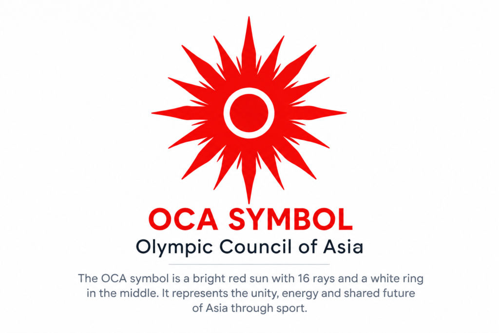
The OCA symbol is one of the most crucial to grasp.
The bright red sun is the recognizable symbol of the Olympic Council of Asia and is incorporated into the visual identity of Asian Games editions.
Olympic Council of Asia uses the bright red sun as the symbol of the Olympic Games, and it has been featured in the graphics of all Asian Games editions.
Why Does the Asian Games Logo Change?
The Asian Games travel to different cities and countries across Asia. Every host city has its own history, culture, landmarks, environment, and identity.
A custom emblem allows the organizers to communicate those characteristics visually.
That is why one Asian Games emblem may feature:
- A local legend
- A famous landmark
- A traditional symbol
- A flower or natural feature
- A river or landscape
- Sporting movement
- Modern technology
- Asian unity
- Environmental themes
Asian Games Logo History
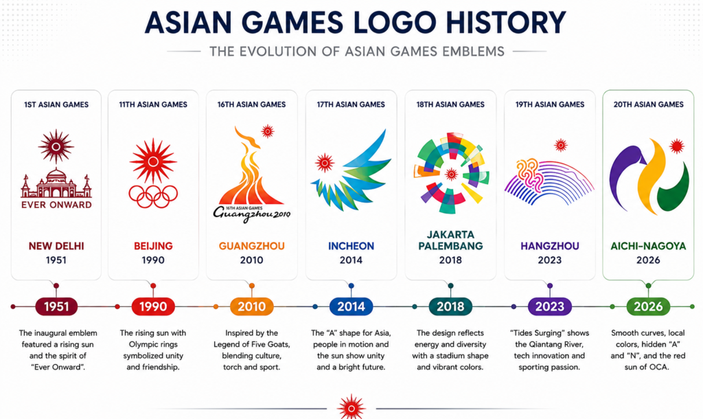
The Asian Games logo originates from the first Asian Games held in Asia was the Asian Games in 1951 in New Delhi.
The first edition of the Games was conducted in Delhi between 4th March and 11th March, 1951. The 11 National Olympic Committees were represented, with a total of 489 athletes taking part in 12 sports and 57 events.
Since that first edition, the Asian Games have moved between host cities throughout Asia. The OCA’s official Games timeline records editions from New Delhi 1951 through Manila 1954, Tokyo 1958, Jakarta 1962, and subsequent Games, leading to the modern editions and Aichi–Nagoya 2026.
Early Asian Games Identity
The early Games established the foundation for the visual tradition that later hosts would develop.
The identity needed to communicate a simple but powerful idea: Asian nations coming together through sport.
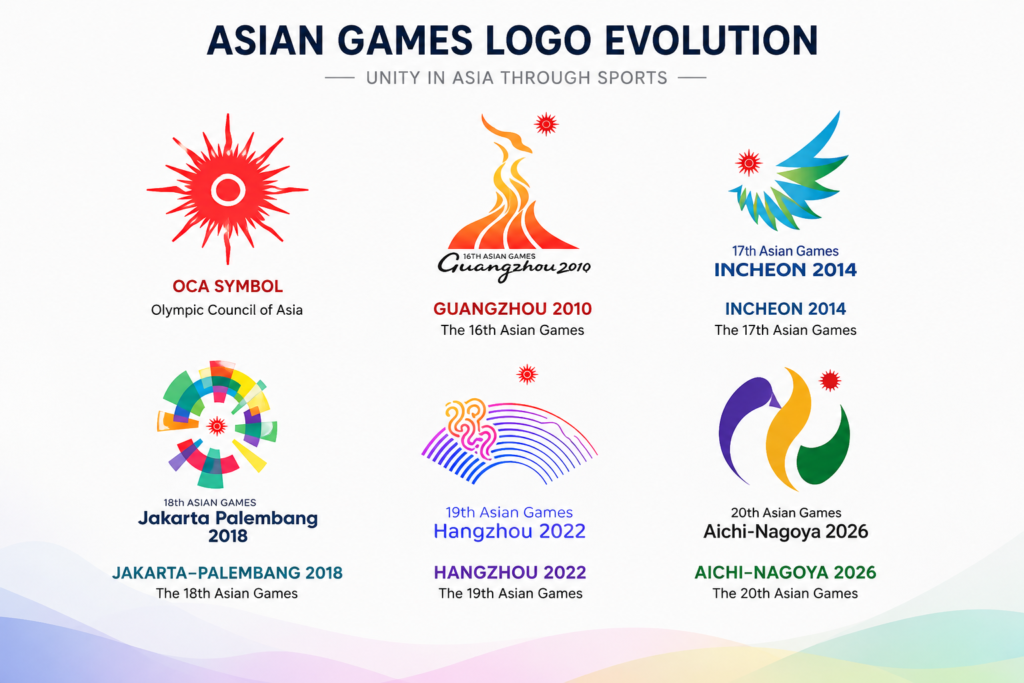
Guangzhou 2010: The Five Goats
Guangzhou 2010’s emblem is a good example of expressing local stories.
Incheon 2014: Asia, Unity and Movement
The Incheon 2014 logo was anything but ordinary.
Hangzhou 2023: Tides Surging
The emblem for “Hangzhou 2023” featured more than just a single symbol; rather, the color, word, and form harmoniously fused together to create the project title, ‘Tides Surging ‘.
Asian Games Logo History at a Glance
| Edition | Host City | Notable Emblem Idea |
| 1951 | New Delhi | First Asian Games visual identity |
| 2010 | Guangzhou | Five Goats and Guangzhou’s local legend |
| 2014 | Incheon | “A” for Asia, unity and movement toward the sun |
| 2018 | Jakarta–Palembang | Gelora Bung Karno Stadium and the OCA sun |
| 2023 | Hangzhou | Qiantang River, tidal bore, sport, Internet and culture |
| 2026 | Aichi–Nagoya | Sport movement, Aichi, Nagoya, environment and OCA identity |
What Does the Aichi–Nagoya 2026 Logo Mean?
The Aichi–Nagoya 2026 emblem is designed around several interconnected ideas.
Its symbolism can be broken down into:
1. Smooth Curves Represent the Liveliness of Sport
The first thing many people notice is the emblem’s flowing shape.
According to the official Aichi–Nagoya 2026 explanation, the smooth curves describe the liveliness of sports.
2. The Central Line Represents People Coming Together
At the center is a straight line made from purple, gold, and green.
The organizers explain that this line creates an image of people gathering together as one and moving forward toward the future, heading toward the bright red OCA sun.
3. Purple Represents Aichi
The purple color is the color of the prefectural flower of Aichi, the name of the iris.
This will help to have the emblem in direct association with the prefecture where it is being used.
4. Gold Represents Nagoya
The gold element represents Kinshachi, the golden tiger-fish roof ornaments associated with Nagoya Castle.
Kinshachi are an important visual symbol of Nagoya, so the gold connects the international sporting event directly with the host city.
5. Green Represents Environmental Awareness
The green color represents environmental consciousness. Green symbolizes the environmental awareness of Aichi-Nagoya.with Aichi-Nagoya.
The official organizers link this concept to events and experiences such as EXPO Aichi 2005 or COP10 and the UNESCO World Conference on Education for Sustainable Development.
6. The Red Sun Represents the OCA
The bright red sun is perhaps the most important link between the Aichi–Nagoya design and the wider Asian Games identity.
The official emblem explanation identifies the sun as the OCA symbol.
7. The Hidden “A” Represents Asia and Aichi
One of the cleverest details in the 2026 design is the hidden lettering. The purple curve combined with the central line creates the shape of an “A.”
The organizers explain that this represents:
- Asia
- Aichi
8. The Hidden “N” Represents Nagoya
The purple and gold elements also create the shape of an “N.” This represents Nagoya, the principal host city.
Together, the hidden letters make the emblem particularly appropriate for the event:
A = Asia / Aichi
N = Nagoya
Who Designed the Asian Games 2026 Logo?
Hiroshi Miyashita is the designer of the Aichi–Nagoya 2026 emblem.
Miyashita completed a design degree at Aichi University of the Arts Graduate School and was an associate professor at the Department of Design at Aichi Sangyo University. He is officially a graphic designer as well.
Asian Games Logo vs Symbol vs Emblem vs Slogan vs Mascot
On the web, these terms are commonly interchanged, but they are not the same.
| Element | Purpose |
| OCA Symbol | Represents the Olympic Council of Asia |
| Games Emblem | Visual identity created for a particular Asian Games edition |
| Logo | Common term used for a visual brand mark |
| Slogan | Communicates the central message or idea of the Games |
| Mascot | A character used to represent and promote the event |
Frequently Asked Questions
What is the symbol of Asian Games?
The term Asian Games is a colloquialism for the Games’ logo. Each of the editions will receive its official emblem, and there is an OCA emblem for the organization in toto.
What does the Asian Games symbol mean?
The OCA symbol is represented by a bright red sun. In the Aichi–Nagoya 2026 emblem, the red sun is explicitly identified as the OCA symbol.
What does the red sun in the Asian Games logo represent?
The logo’s central ray of the sun is bright red, representing the OCA symbol, and points to Aichi–Nagoya 2026.
What is the Asian Games 2026 logo?
Organic curves, a bright red sun with eight rays from the OCA, and purple, gold, and green patterns intertwine to form the Aichi-Nagoya 2026 logo.
Who was the designer of the Asian Games 2026 logo?
Hiroshi Miyashita is the designer of the Aichi–Nagoya 2026 emblem, a graphic designer and a faculty member at the Department of Design, Aichi Sangyo University.
Final Thoughts
The Asian Games logo reflects the history of the Asian Games. Sport and place, culture and identity have all been intertwined in their own unique ways by the host cities since New Delhi 1951, and the current identities of the cities of Guangzhou, Incheon, Hangzhou and Aichi–Nagoya.
This tradition continues with the Aichi–Nagoya 2026 emblem, which features a combination of several ideas in one.